Here's a video clip from Yoshi's Island. Whenever Yoshi touches the fuzzy monster, he get's dizzy, and the resulting landscape looks like a morphing, rolling, psychedelic landscape:
Friday, February 29, 2008
Thursday, February 28, 2008


Sunday, February 24, 2008


Saturday, February 23, 2008


Friday, February 22, 2008
So Cal Earthquake Resource

Kanye West by Murakami
The first few seconds of this video look like an earthquake/glitched-out urban landscape. Don't blink or you'll miss it:
I think someone videotaped this from the MOCA exhibit, which accounts for the earthquake like shakiness. And, I'm not even sure if the glitch is part of the music video or not, but whatever! I thought it appropriate to share.
I think someone videotaped this from the MOCA exhibit, which accounts for the earthquake like shakiness. And, I'm not even sure if the glitch is part of the music video or not, but whatever! I thought it appropriate to share.
Thursday, February 21, 2008
Quake Sketch 2 - closeups
I'm going to work in XSI & stop-motion. We'll composite Deborah's 2D textures & layers. Some of the 3D elements, such as ribbon-like forms of sediment layer, will act as visual themes to unite the various dimensions & worlds.


close up rock texture
I like the subtle rock textures here

close-up on James Ward's Gordale Scar, 1811-13
and textures, color, lava-like forms here

close-up on John Martin's Great Day of His Wrath, 1851-3.

close-up on James Ward's Gordale Scar, 1811-13
and textures, color, lava-like forms here

close-up on John Martin's Great Day of His Wrath, 1851-3.
Monday, February 18, 2008
Falling Down


Collage by Miwa Mateyek:

I could definitely see the above picture being animated. The homes falling down, breaking apart, into the ground.
Storyboards and Style Frames
For this project, I'd like to create graphic elements (maps, graphics, tectonic plates, text). I'm drawn to contour lines and bright colors (love the colors of heat maps). I'd also like to possibly recreate an animated heat map-like the animations in the below posts.
Here are some rough storyboards. I'm not quite comfortable with the Wacom yet, so these are very rough:


Here are some images that I like:


Here are some rough storyboards. I'm not quite comfortable with the Wacom yet, so these are very rough:


Here are some images that I like:


Earthquake Animations
The Quake Project:
Nice colors and graphic quality. I think I'd like to try to reproduce something like this.
Nice colors and graphic quality. I think I'd like to try to reproduce something like this.
Monday, February 11, 2008

Emotional Landscapes
Tagline:
Exploring above and below the surface.
Treatment:
Landscapes connected underground through seismic activity. (snowscapes, woodlands, rolling hills...)
Examples of animation: Shifting plates push crystals above ground. Character recording seismic activity.
Music:
Movement and animation based upon a composed "graphic score" taken directly from a seismic graph.
Mediums:
3D, 2D, compositing
Style References:


Friday, February 8, 2008
Plate Tectonics
Now, to totally shift gears.
Landscape paintings by Leslie Wayne:


I love the idea of animating this. It's just a simple idea, the earth. Glitches and Earthquakes. I love the idea of compositing the shifting layers together. Could also combine a lot of mediums and textures.
Reminds me of this Bjork video by Gondry:
I know that it doesn't have much to do with Art Nouveau, but we still need that concept. So, I'm just throwing some fresh ideas out there. Perhaps it's difficult starting from style rather than ideas?
Monday, February 4, 2008
J.C. Leyendecker


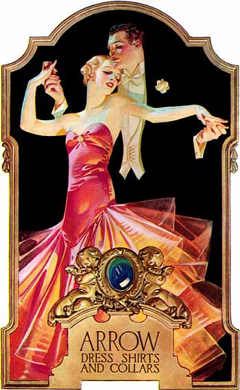
J.C. Leyendecker was a popular American illustrator in the early to mid 20th century. He popularized many famous icons such as the jolly fat Santa Claus and the new years baby through his illustrations and advertisements in various magazines. The style above is known as cut away or cut out illustration, where the body is deconstructed into simple shapes by having the background color the same as the subjects clothing.


Sunday, February 3, 2008


Beautiful Decay
Part of my inspiration for this noveau-psychedelic aesthetic was inspired by Beautiful Decay, a design collective I first discovered this summer. It was started by Amir Fallah, someone I went to undergrad with (though I don't remember him - oye!). Here's an interview with Amir. I especially like the use of text and color.


Amir's paintings and installations are very nice, too! Here's one that was at La Louvre Gallery


Amir's paintings and installations are very nice, too! Here's one that was at La Louvre Gallery


Saturday, February 2, 2008
Mash-Up
Look for the cat:
Also starring lots of cats:
I think this whole video/glitch/80s kitsch has been done quite a bit, but I think they're successful in tapping into the whole phenomenon. It would be cool to stick with art nouveau imagery and feel to create a mash-up of our own. And, I think using a composer to develop music more specific to that era would help it stand out from the rest.
Subscribe to:
Posts (Atom)